Orlando Villas · Florida Dream Villa
Orlando Park Tickets · Florida Car Hire · US Domestic Car Rental · Florida Car Rental · Enhanced Roadside Assistance
Page 5 of 10 FirstFirst ... 34567 ... LastLast
Results 41 to 50 of 95

Thread: New layout

  1. #41
    Site Owner and Admin floridadreamvilla.co.uk's Avatar
    Join Date
    Jan 2002
    Location
    Bolas Heath, Shropshire, UK and Crescent Lakes, Kissimmee, USA.
    Posts
    21,327
    I've made the title of the threads in the Active Topics list quite a bit larger and in line with how the forum displays actual forum contents. Does this look better for you now please?
    Quote Originally Posted by SDJ View Post
    It is sleek and modern but the colour of the title of the threads and who wrote them is not as easy to read for me as the orange does not stand out for some reason.


  2. #42
    Florida Expert MICKEYSDEN's Avatar
    Join Date
    May 2005
    Location
    Surrey
    Posts
    1,244
    John the orange words are ok it is the box's that I am finding very bright, the ones with the white writing, like the 'quick reply' one and the date and time ones between the replies
    Karen


  3. #43
    Super Moderator
    Join Date
    Feb 2003
    Posts
    4,090
    Quote Originally Posted by floridadreamvilla.co.uk View Post
    I'm on a mission to purge all the green font as I totally agree. I though I'd spotted them all but must have missed that one. I'll get it sorted in the morning.
    Thanks John. Like the new look gives it a great new feel


  4. #44
    Super Moderator DaveL's Avatar
    Join Date
    Jun 2003
    Location
    High Wycombe
    Posts
    2,456
    Personally I find the new font size on the list a little to large.

    When compared to the rest of the text it just does not scan so easily.

    Dave
    Dave Lewis


  5. #45
    Site Owner and Admin floridadreamvilla.co.uk's Avatar
    Join Date
    Jan 2002
    Location
    Bolas Heath, Shropshire, UK and Crescent Lakes, Kissimmee, USA.
    Posts
    21,327
    I can reduce it slightly if needs be. What do others thing, especially those who mentioned the text was initially hard to read?
    Quote Originally Posted by DaveL View Post
    Personally I find the new font size on the list a little to large.

    When compared to the rest of the text it just does not scan so easily.

    Dave


  6. #46
    Florida Expert autumnc's Avatar
    Join Date
    Jan 2008
    Location
    Greece & Orlando
    Posts
    1,028
    Loving the new look, very slick and modern. A million times better on my phone too!

    Quote Originally Posted by DaveL View Post
    Personally I find the new font size on the list a little to large.

    When compared to the rest of the text it just does not scan so easily.

    Dave
    The font is pretty tiny on mine, so perhaps it displays differently according to individual settings?
    Sarah


  7. #47
    Gold 5 Star Member E. Cosgrove's Avatar
    Join Date
    Apr 2004
    Posts
    7,487
    Quote Originally Posted by floridadreamvilla.co.uk View Post
    I see you have answered your own question .

    To give you some background, the change a few years ago from the old forum format to the new one was akin to moving house as the forum software totally changed and we had to find new ways of doing what we were all used to on the old forum software. This latest look and feel update is akin to changing a pair of curtains in your existing front room in that the forum software is exactly the same as before the look and feel update, it's just the formatting on the screen that has changed a bit. All old posts should display exactly the same now as before.
    Great analogy John, a bit like Steve and his Mercedes v Ford Fiesta[]


    Liz


  8. #48
    Gold 5 Star Member
    Join Date
    Jan 2007
    Posts
    2,468
    Overall I am liking it but I think the black headers a little harsh and the orange font on black is not easy to see.

    Perhaps a darker grey almost black would be better. Just my two pennies worth


  9. #49
    Site Owner and Admin floridadreamvilla.co.uk's Avatar
    Join Date
    Jan 2002
    Location
    Bolas Heath, Shropshire, UK and Crescent Lakes, Kissimmee, USA.
    Posts
    21,327
    I've changed the orange text on the black headers so it's now white and much easier to see. I must have missed that one earlier.
    Quote Originally Posted by Pookie View Post
    Overall I am liking it but I think the black headers a little harsh and the orange font on black is not easy to see.

    Perhaps a darker grey almost black would be better. Just my two pennies worth


  10. #50
    Super Moderator DaveL's Avatar
    Join Date
    Jun 2003
    Location
    High Wycombe
    Posts
    2,456
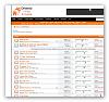
    This is my default view using Chrome which made me comment on the font size. Do others see the same display?

    Dave

    Click image for larger version. 

Name:	Screen_2015.01.16_14h29m53s_002_.jpg 
Views:	18 
Size:	60.4 KB 
ID:	1091
    Dave Lewis


Bookmarks

Posting Permissions

  • You may not post new threads
  • You may not post replies
  • You may not post attachments
  • You may not edit your posts
  •